

Here are a few examples of logos I’ve created for clients. Further below is a small demonstration explaining how I create logos for clients through proofing. I can always provide more examples (and other sections show logos I’ve created for people as well) for those interested, but this should be a good

CoKaNe Metals
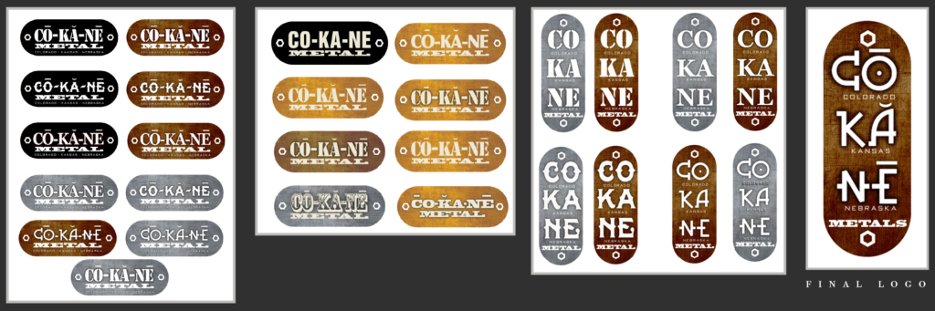
This was made for CoKaNe Metals. They did welding and repair for machinery and anything that required metalwork. They wanted a logo that not only showed the tri-state area they worked in, but a logo they could create out of metal and place on their repairs for marketing.
JACOR Facilities Management
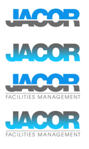
This was for JACOR Facilities Management. They wanted a logo that was just their name with a blue and gray gradient.
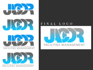
TURF Designs
This was for a landscaping company that was creating a service for watering system that stopped the waste of water during the watering process. Obviously they wanted a design with the Colorado flag incorporated into it.
CANINE TRAINING SOLUTIONS
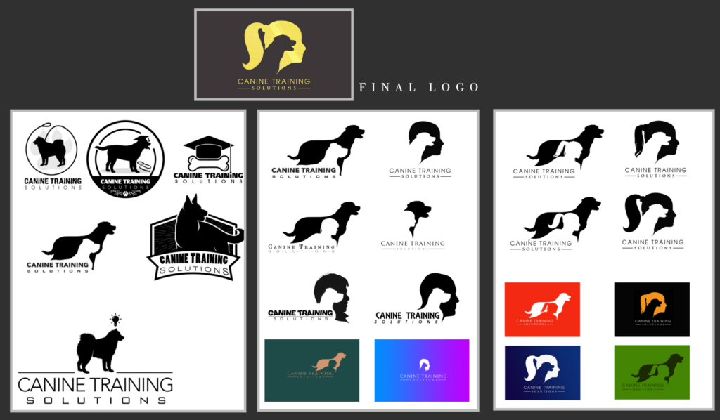
This was for Canine Training Solutions. She wasn’t sure at first what she wanted, then the idea of having a silhouette being a part of the logo was something she wanted. Then the idea of a woman with a ponytail (like herself) was wanted. Soon we narrowed it down to the final logo.
Logo Design Example
For those interested, below is an example of how I design and put together a logo for a client.
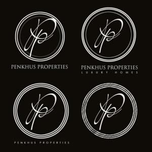
I’ll start with Penkhus Luxury Homes which I did quite a while ago.
I first started off with offering a few various different examples and variations of different styles and ‘feels’ that go to the ‘luxury’ side while keeping the real estate purpose as well.
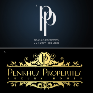
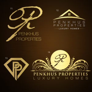
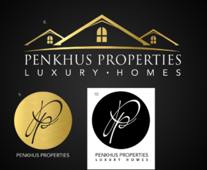
While offering the different styles and ideas, I also included various color schemes and styles as well. That way they could decide on the sort of palette they might want as well. Where a good logo should look as good in black and white as it will while in color. (And visa-versa.)
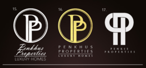
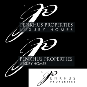
I provided a few more styles that were lost to time, but for this example, it works given they liked the more circular intertwined ‘P’ variation.
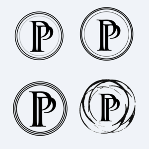
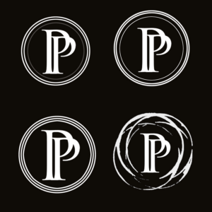
Given they liked that look, I provided more variation that fit that style.
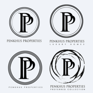
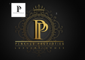
From there they picked their final design. From there I made vector versions and provided a few different variations for them to use.
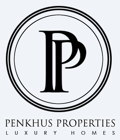
Now if you google them, they still use the same logo today. (I believe they went with a blue version of the logo.) That’s a more simple demonstration on how I create logos for clients that need such services.
If you are interested you can contact me at 719-213-6273 or at derek@workgraphicdesign.com.
If you wish, you can go to the contact section for more information or contact me through the online form.
